Data Storytelling: Make Your Data Clear, Useful, and Actionable
You look at a chart and think, “What am I supposed to do with this?” Most business teams have lots of data, but turning it into something everyone can use is hard. Data storytelling changes this. It helps you see what’s important, share it with a broader audience, and make business decisions that matter.
What is Data Storytelling?
So, what is data storytelling? It means finding stories in data and sharing them in a way that people can understand and use. This isn’t just about making a nice chart—it’s about creating a compelling narrative that makes your numbers matter.
Storytelling with data uses effective visualizations and a clear explanation. The result is a message that helps teams take action, close communication gaps, and reach a wider audience. In short, it’s about connecting facts, people, and decisions.
The Role of Narrative in Data Presentation
People remember stories, not just facts. That’s why a compelling story is a key element of any strong presentation. Contextual narrative gives your data meaning. A story has a setting, key players, a problem, and a solution.
Harvard Business Review has shown that when you use narrative, you help people understand even complex datasets. You also get emotional benefits—people connect with the story, which helps them remember the key takeaway and act on it.
Key Elements of Data Storytelling
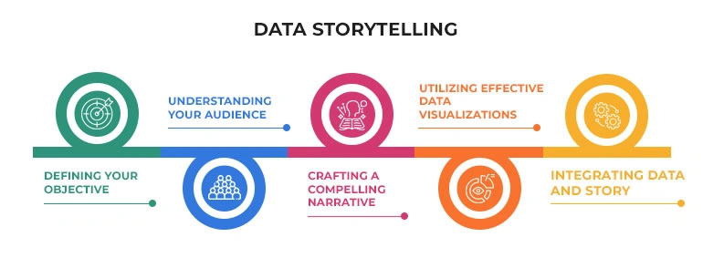
Defining Your Objective
A good data-driven story starts with a purpose. Do you want to support a business strategy? Are you trying to help a marketing team understand a marketing campaign? Your objective shapes your story. Clarity here is a helpful tool for creating actionable insights.
Understanding Your Audience
Different people need different things. Technical and non-technical stakeholders see data differently. A target audience of executives may want the bottom line, while analysts want details. Understanding your audience is important for closing communication gaps and reaching a broader narrative.
Crafting a Compelling Narrative
A compelling narrative pulls everything together. It uses:
- Descriptive Analysis to explain what happened
- Exploratory Data Analysis to ask why it happened
- Explanatory analysis to suggest what to do next
This structure helps you turn information into an effective data story.
Utilizing Effective Data Visualizations
Charts and graphs are visual representations that help people see patterns. But effective data storytelling uses interactive data visualizations that do more than just show trends. They highlight key insights, support data-driven decisions, and make complex datasets easier to follow.
When you need to show results, clear visual elements bring out what matters.
Integrating Data and Story
Data visualization storytelling examples show how mixing visuals and narrative makes your point stronger. When you add context to your visuals, you help your team get the message and see why it matters. This approach works for both business intelligence teams and non-technical stakeholders.
Storytelling With Data Examples
Consider a sales report. A table full of numbers may show last year’s results, but it is hard to spot patterns. Add a line chart and a short story about how sales rose after a new promotion, and suddenly the picture is clear.
Another example: A financial analytics dashboard tracks revenue, expenses, and forecasts, making trends clear at a glance. By adding a short narrative, leaders can quickly spot financial opportunities and risks. See real examples at Beyond Key’s Financial Dashboard Examples.
Infographics are also classic storytelling with data visualization examples. They use simple visuals to share facts quickly. Even without much text, they highlight the most important data points and guide the reader to a clear takeaway.
Advantages of Data Storytelling
Stories make data real. If you use a story, people pay attention, remember more, and take action. You reach a wider audience and keep everyone engaged.
Making Complex Information Accessible
Not everyone understands Enhancing Understanding and Engagement raw data. A story breaks down complex datasets and delivers actionable insights. This helps both data experts and non-technical stakeholders.
Driving Informed Decision-Making
When you combine clear stories and statistical analysis, you help teams make informed decisions. Data-driven insights guide business strategy and remove guessing.
Fostering a Data-Driven Culture
If you show the impact of compelling data stories, teams start using data for more decisions. The result is a culture where everyone values and trusts data-driven decisions.
Data Storytelling vs. Data Visualization
Differences and Interconnections
Here’s how they compare:
| Aspect |
Data Visualization |
Data Storytelling |
| Main focus |
Visual elements |
Broader story |
| Use |
Show trends and numbers |
Explain why numbers matter |
| Who uses it |
Data teams |
Broader audience |
| Outcome |
See patterns |
Take action |
Storytelling with data visualization brings both together. You use effective visualizations to support your narrative. This helps you move from, “Here’s the number,” to, “Here’s why this matters for our next move.”
Why Storytelling is More Impactful
A chart without a story answers “what,” but not “why” or “now what”. Compelling stories answer those questions. They create an emotional response and help your team see the value in using data.
Tools and Techniques for Data Storytelling
Selecting the Right Tools
The right tools help you reach your broader audience. You might use Tableau or Power BI for interactive data visualizations. Artificial intelligence can help you find patterns in complex datasets. Predictive models show what could happen next.
The right tool helps you share actionable insights with your team in a way that fits their needs.
Key Techniques for Effective Storytelling
- Give context so people know why the data matters.
- Focus on the main point.
- Let users explore data if they want more detail.
- Use highlights to show key insights.
- Get feedback and make your story better over time.
A practical analytics approach is a powerful tool for building stories that drive change.
Challenges in Data Storytelling
Avoiding Misinterpretations
A common pitfall is assuming everyone will see your point. Be clear. Avoid jargon. Make sure your visuals match your message. Use communication skills to check if people really understand your story.
Balancing Data with Narrative
If you only use story, you lose trust. If you only use data, you lose your audience. A balance of both builds compelling data stories. Use your storytelling skills to connect your audience with the facts.
Making Data Accessible Across Teams
Some teams have job-ready skills in analytics. Others do not. Build custom data platforms or clear dashboards that help everyone use the story.
Ensuring Data Quality and Security
No one trusts a story if the data is wrong. Data governance protects your data and ensures your team trusts your story.
If you are new to data storytelling, you might want someone to guide
to get startedUse Cases and Examples
Successful Data Storytelling in Action
- A marketing team looks at why a marketing campaign had low engagement. They build a story that explains what happened, who was affected, and how to fix it. This helps everyone see the next step.
- A dashboard for company leaders explains why revenue changed, not just that it changed. It uses predictive analytics to show possible futures and supports business decisions.
- In healthcare, data stories help spot patient trends. Interactive data visualizations reveal problems that would be hard to find in a spreadsheet.
More Real-World Examples
Spotify sends every user an annual story about their music habits. It’s a data storytelling example that makes data personal.
Sales teams use SEO data story approaches to explain which deals might close soon. This helps leaders focus their efforts.
Nonprofit organizations show donors the true impact of their gifts with storytelling with data examples—not just numbers, but stories.
These are all real data visualization storytelling examples that show the value of a compelling story.
Conclusion
Data storytelling helps you turn data into action. When you match a clear story with the right visuals, teams understand what you mean and know what to do. Effective data storytelling builds trust, helps with business strategy, and makes your data useful for a broader audience.
If your team wants to use data in a better way, see how business-focused data storytelling can help.
How We Can Help
At Beyond Key, we help businesses build clear, actionable data stories.
Our data visualization services and data analytics consulting can help you move from raw numbers to real impact.
If you want to learn more or need help building your data storytelling skills, connect with us.